This article focuses on best practices and hands-on guidance. It complements—rather than duplicates—the technical guide, so both are worth reading. For in-depth walkthroughs of individual features, the Topol support center provides detailed articles with step-by-step instructions.
Basic Building Blocks: Structures and Content Blocks
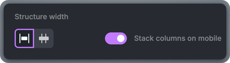
Email templates consist of structures and content blocks. Understanding the relationship between these two concepts is the single most important thing to learn as a new user—it makes every other feature easier to use. A structure defines the layout. It controls how many columns appear in a row and how content behaves on desktop and mobile devices. Structures can have one, two, three, or four columns. To add a structure, open the Structure tab and drag it into the template.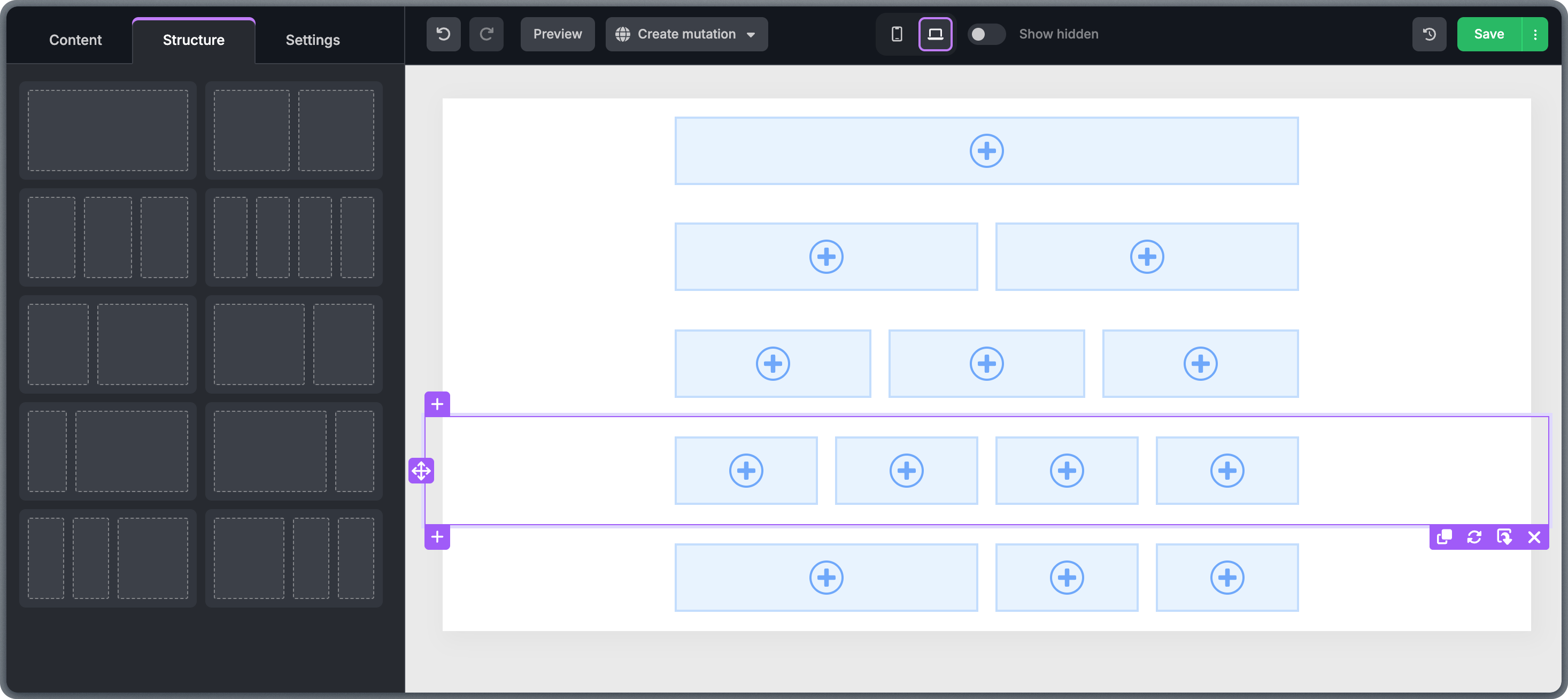
Working with Structures
When you click inside any structure, a border appears with multiple action icons. Use these to move, duplicate, save, or perform other actions on the structure. For a deeper dive into structure options, see the Structures article.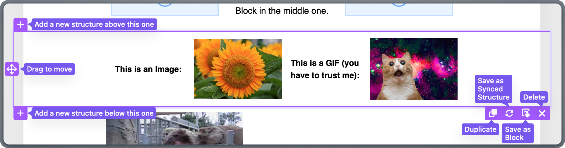
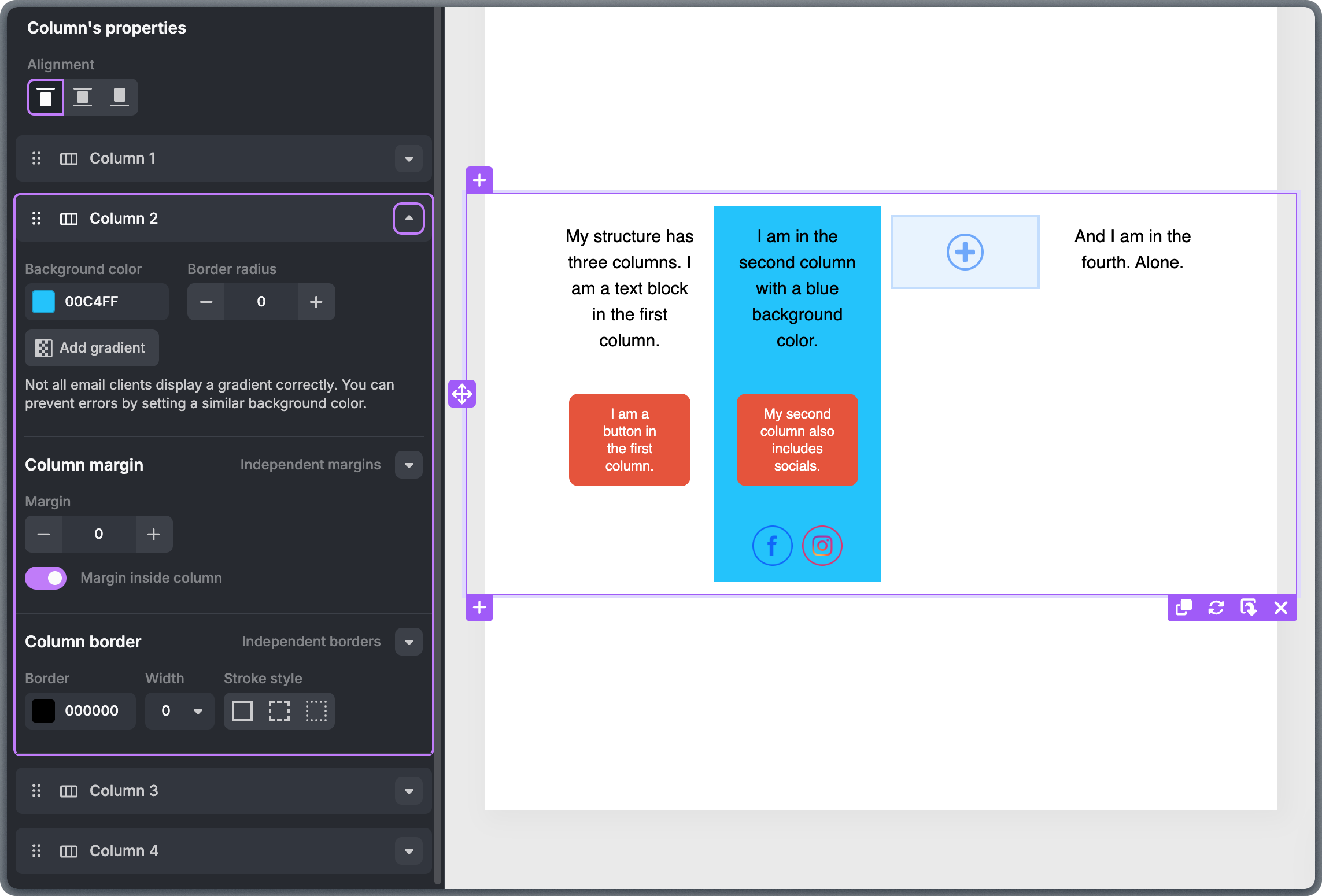
Working with Columns
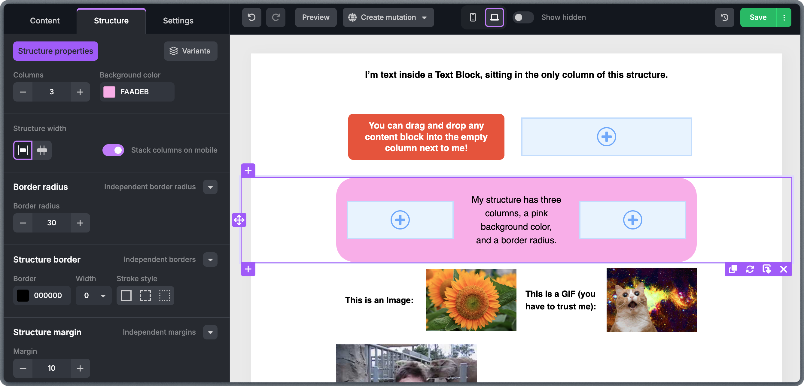
Each structure can hold up to 8 columns, and each column can hold as many content blocks as needed. To change the number of columns, select the structure and adjust the column count in the left-side panel.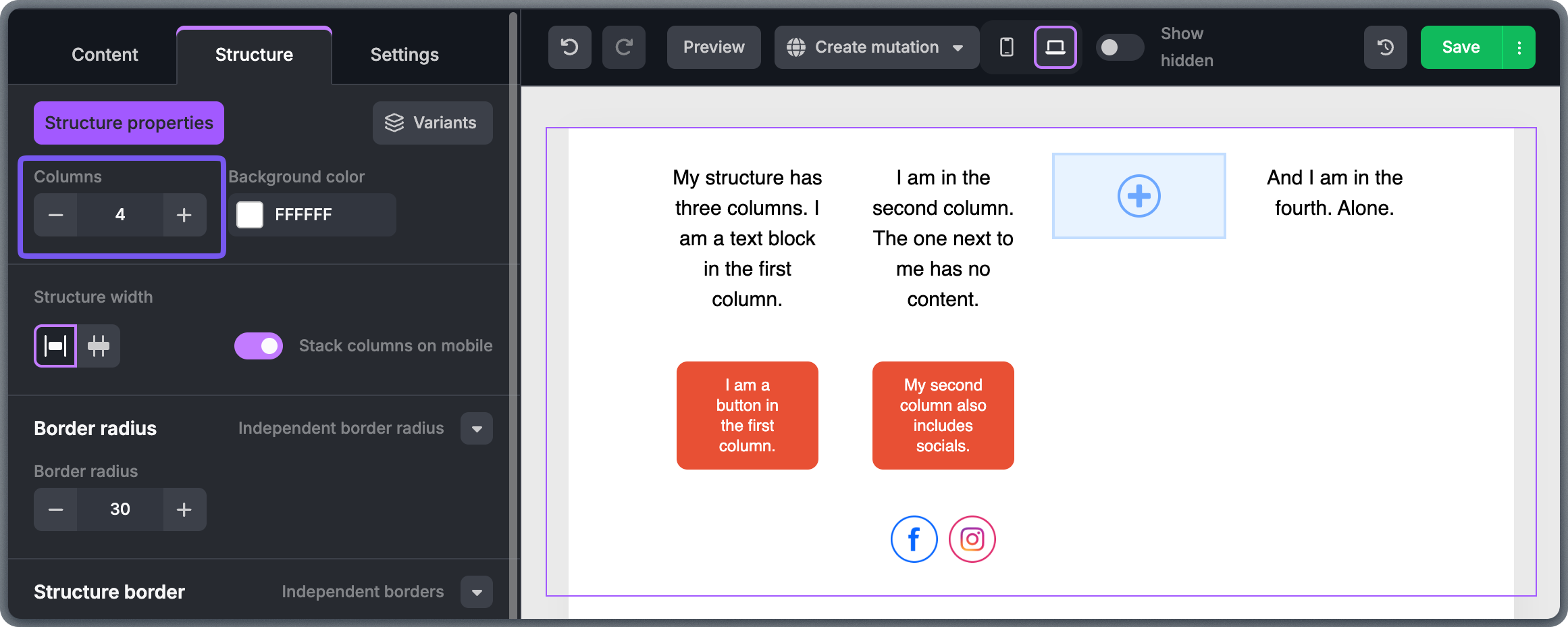
Working with Content Blocks
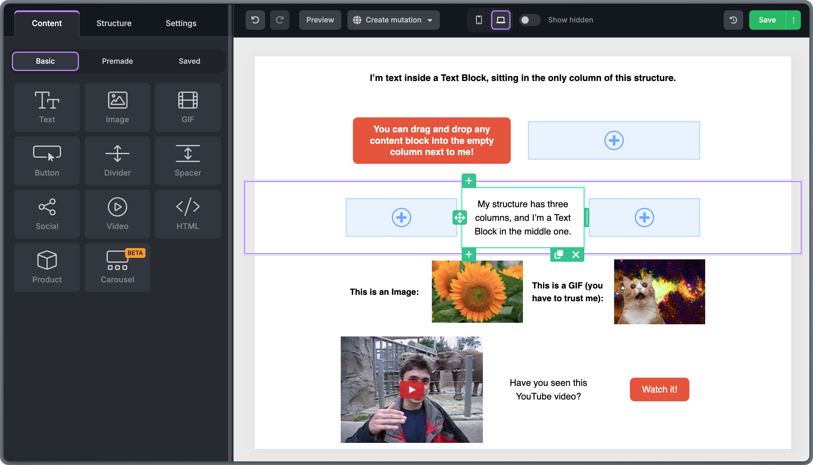
There are 10 types of basic content blocks, each designed for displaying a specific type of content. Similar to structures, you can perform actions directly through the buttons on the border of each block. For detailed guidance on working with individual block types, see the Text, Image, and Button block guide.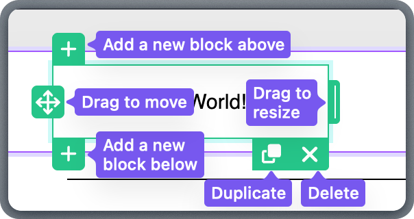
Text Blocks
Edit text directly in the template using the formatting toolbar that appears above an active text block. These settings initially inherit global styles defined in the Settings tab but can be adjusted individually.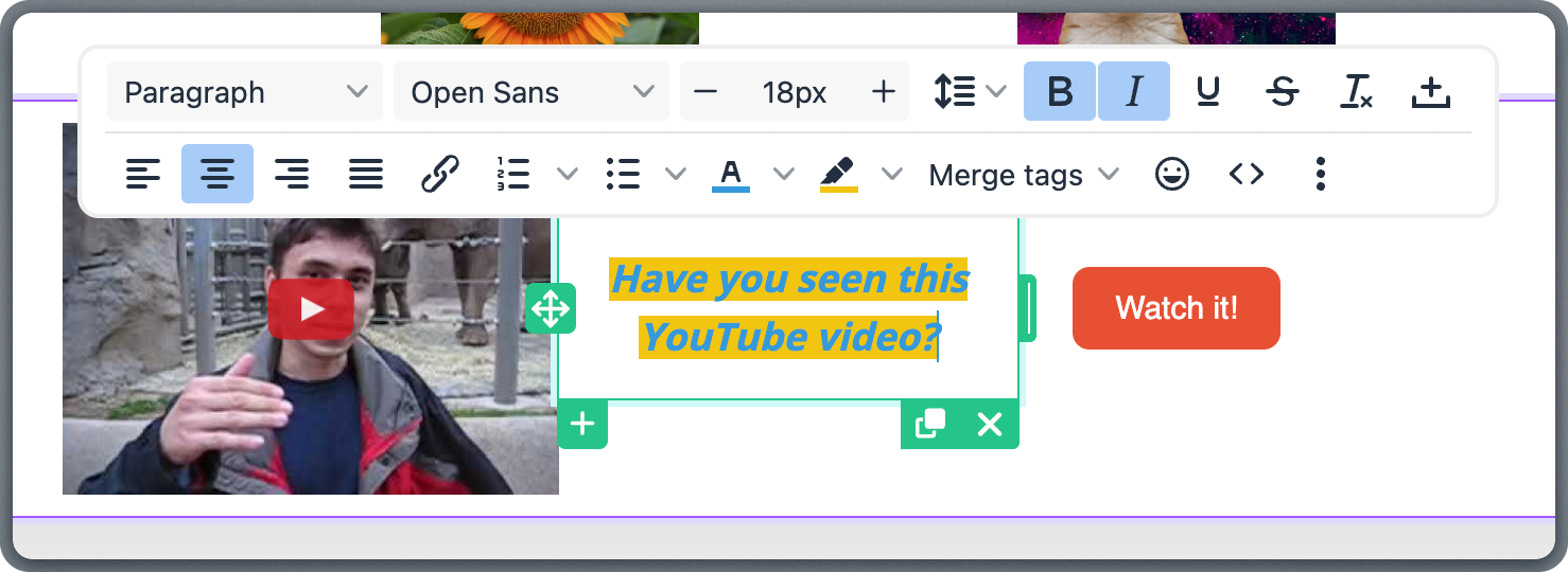
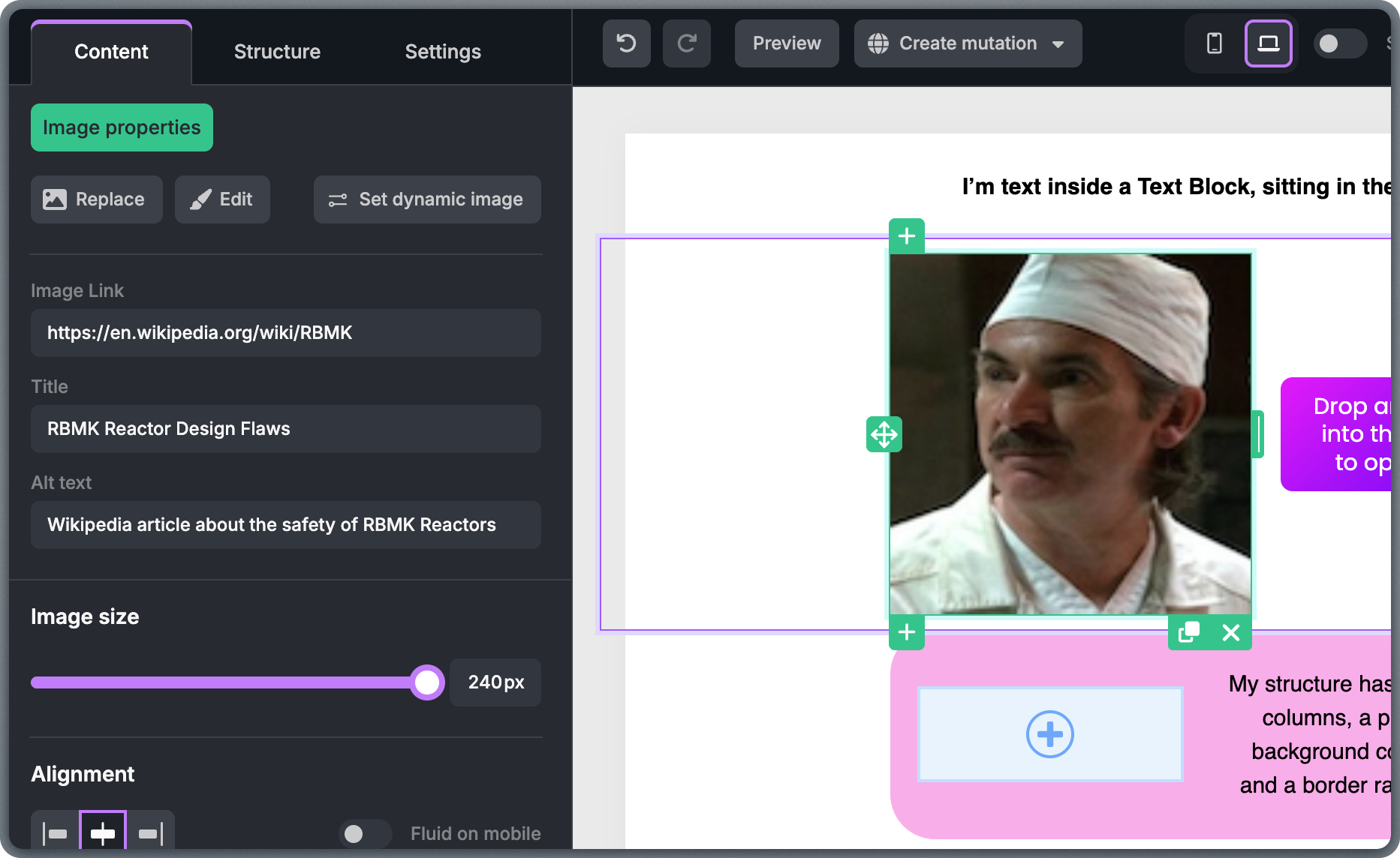
Images
Images should support the message of the email, not overwhelm it. Use images intentionally and avoid decorative visuals that add no value. To insert an image, drag the Image block into a structure. This reserves space for an image, but nothing displays yet.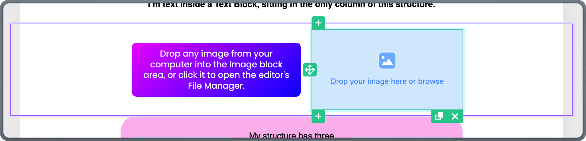
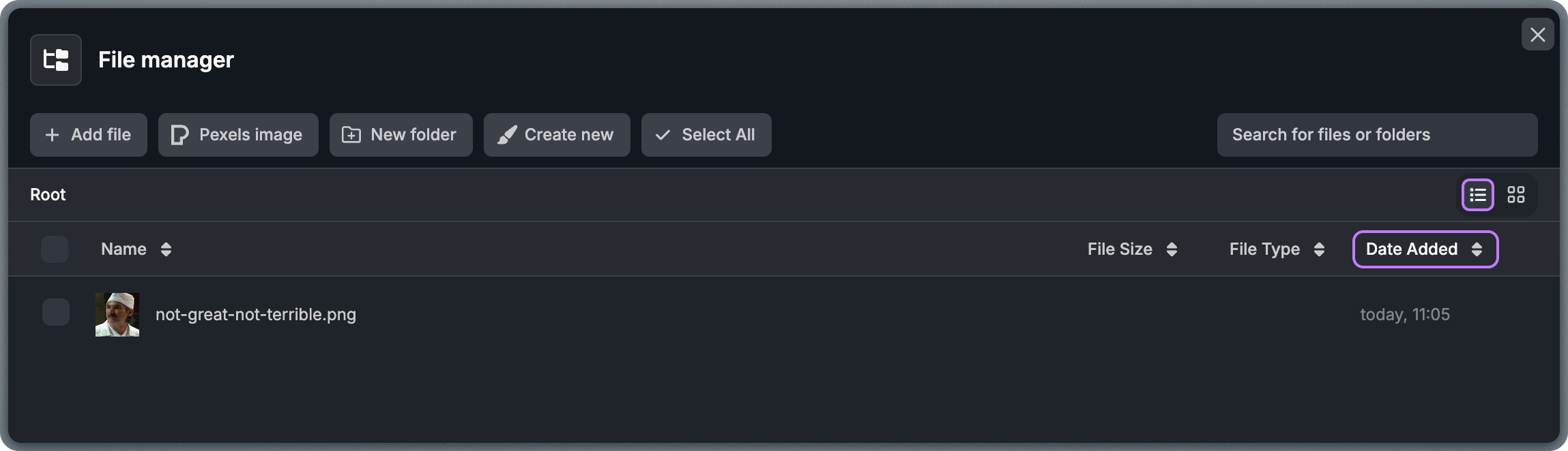
Images uploaded to File Manager are available team-wide and can be reused across templates. They are stored in your team’s Storage Domain and served from your custom domain.
GIFs
GIFs can add motion and draw attention, but use them sparingly and with purpose. Short, subtle animations work best and help avoid distractions. Working with GIFs is similar to working with images, but instead of uploading to the File Manager, you link a GIF directly from an external source. You can adjust most of the same properties as images in the left-side panel.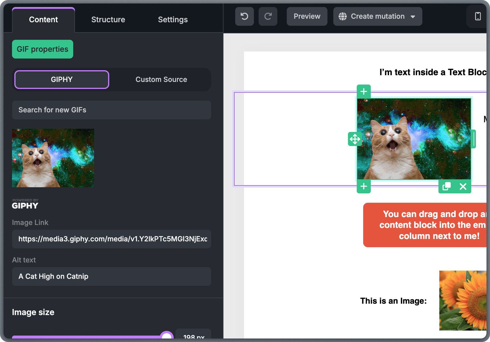
Buttons
Buttons should have a clear purpose and guide readers toward one specific action. Use short, direct text that describes what happens after the click, such as “Shop now” or “Read more.” One to three words is usually enough. To make buttons functional, add a link by selecting the button and entering the URL in the left-side panel.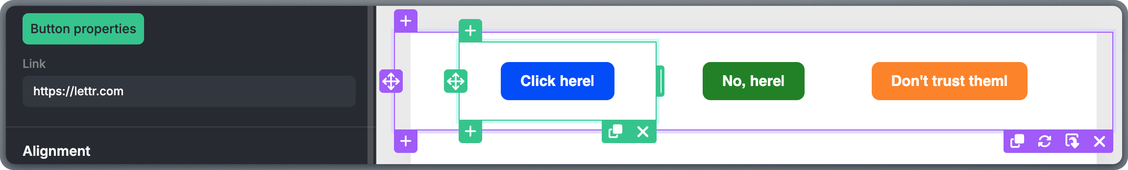
Spacers
Spacer blocks control vertical spacing between elements in a template. They create visual breathing room and improve readability without affecting the content itself.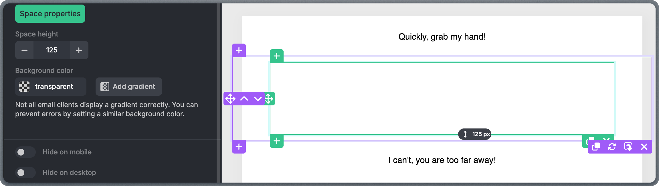
Dividers
Divider blocks visually separate sections and help structure email content. They provide a clear visual break between different parts of a template without adding extra text. When selected, the left-side panel lets you adjust the divider’s color, thickness, style, margin, and height.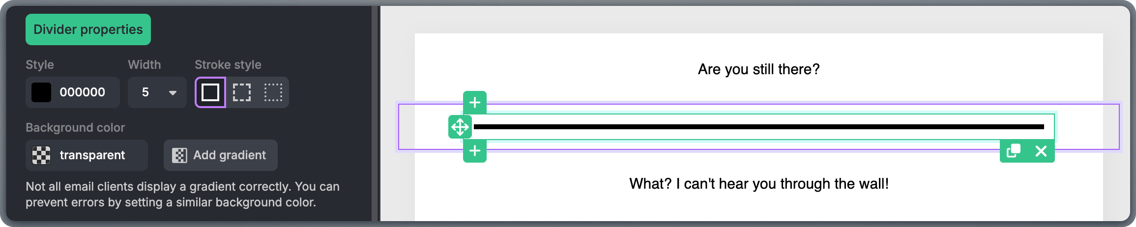
Social
Social blocks link recipients to your brand’s social media profiles on networks such as Facebook, Instagram, X (Twitter), LinkedIn, or custom URLs. Each icon can be enabled or disabled individually, reordered, and linked to the correct destination. For more details, see the Social Network Icons guide.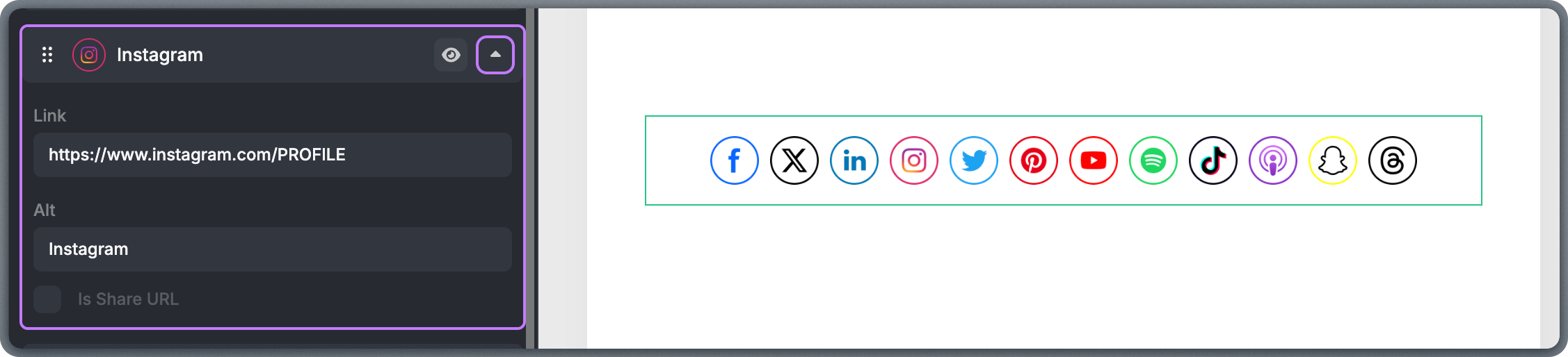
Video
The Video block lets you include video content in an email-friendly way. Because most email clients don’t support embedded video playback, the Video block displays a clickable thumbnail image that links to the video.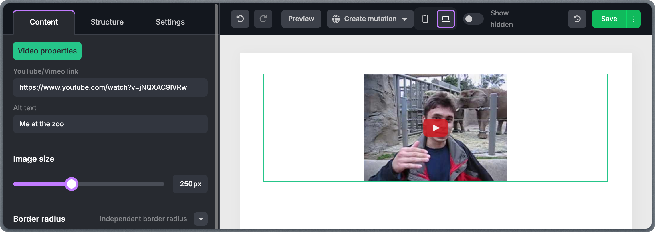
HTML
HTML blocks let you insert custom HTML code directly into your template. This is useful for advanced layouts, custom tracking elements, or integrations that standard content blocks can’t achieve. For guidance on what works well, see the HTML in Topol guide.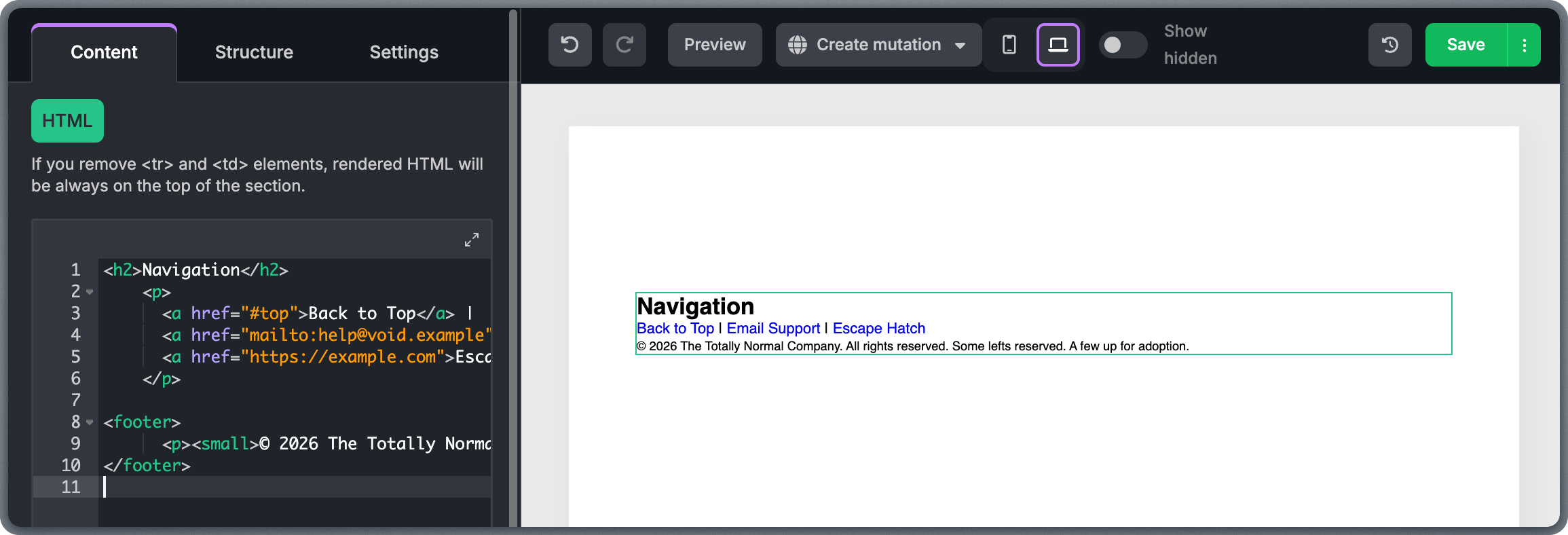
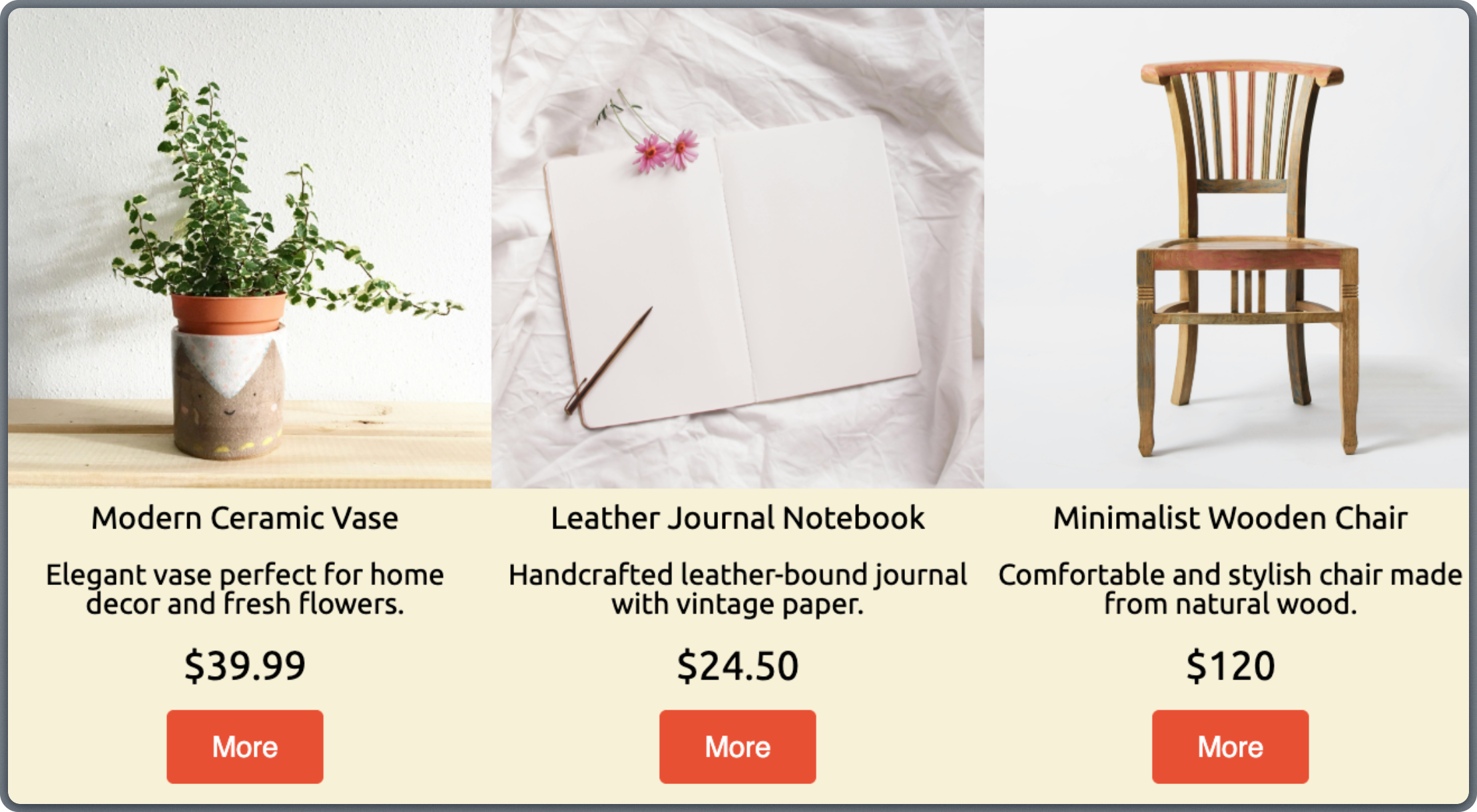
Product
Product blocks are designed for e-commerce emails and work with Product Feeds. A Product block represents a complete product unit, including image, name, description, price, and button. For setup instructions, see the E-commerce Products guide. To use a Product block, drag it into a structure and select a product feed and product in the left-side panel.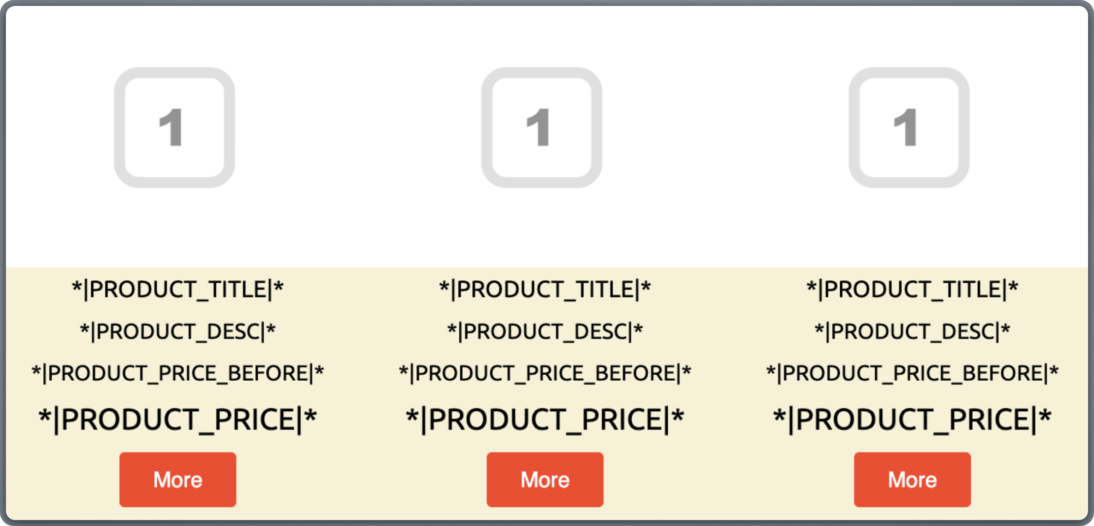
Working with Top Bar
The Top Bar gives you quick access to the tools you’ll use most while building and reviewing templates. These buttons help you stay in control as you edit, experiment, preview, and prepare templates for use.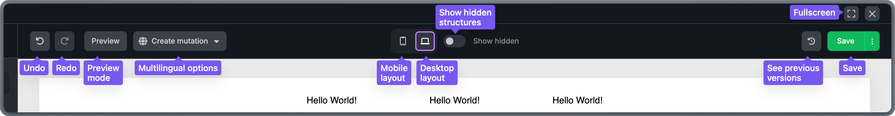
Undo and Redo
Undo and Redo are your safety net while editing. They let you quickly step backward or forward through recent changes, whether you’ve edited text, moved blocks, adjusted layouts, or changed settings. Just keep in mind that Undo and Redo only work within your current editing session, so they don’t replace saving or autosaves.Multilingual options
The Multilingual option is used when you’re working with templates that need to exist in more than one language. It lets you switch between language versions of the same template while keeping the layout consistent. For a full walkthrough, see the Multilingual Templates guide.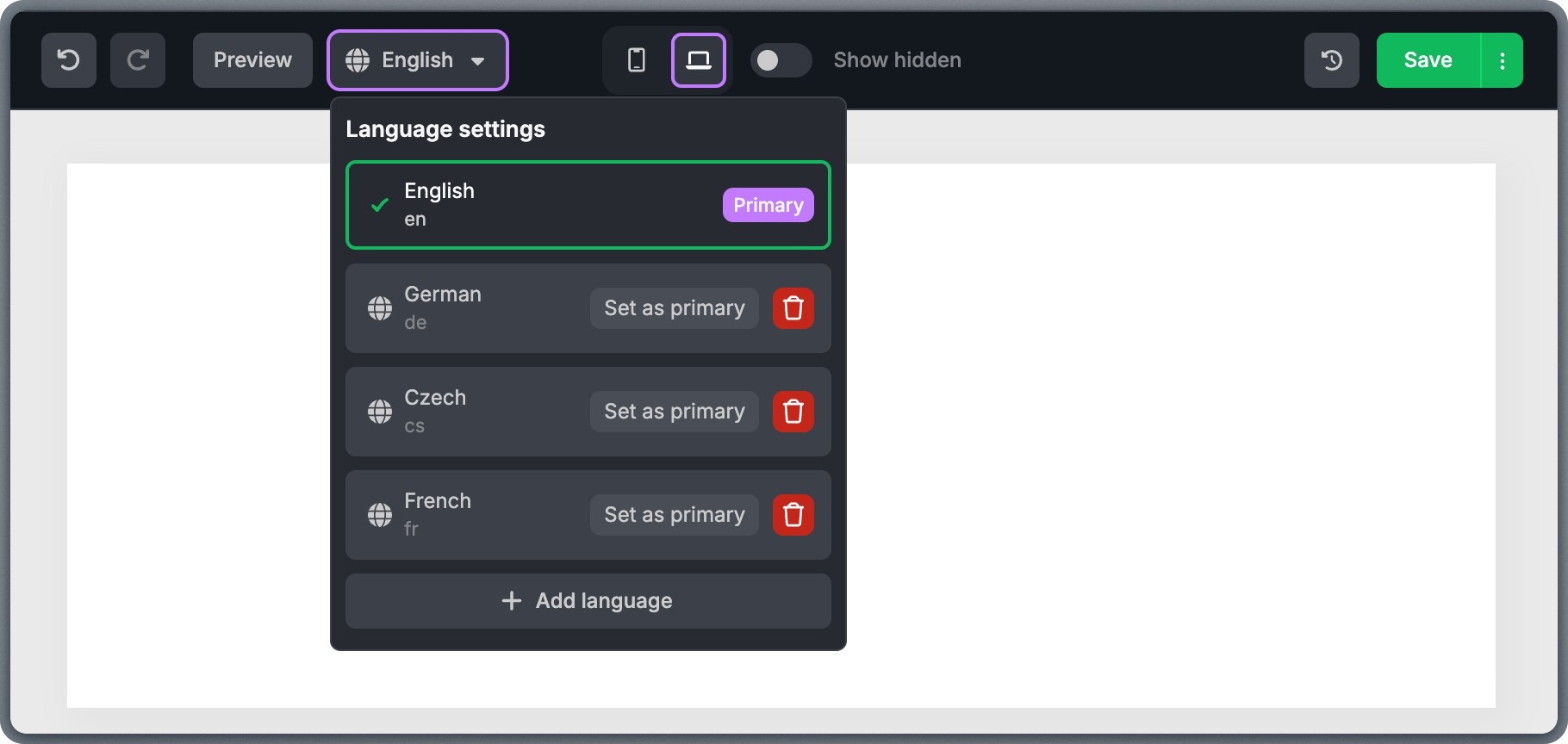
Desktop and Mobile view
One of the greatest advantages of our editor is that all your templates are built mobile-first and are responsive by default. The Desktop/Mobile view toggle lets you quickly see how your email will look on larger screens versus smaller mobile devices. For more on responsive design, see the Desktop and Mobile optimization guide and the Mobile-first email template design article.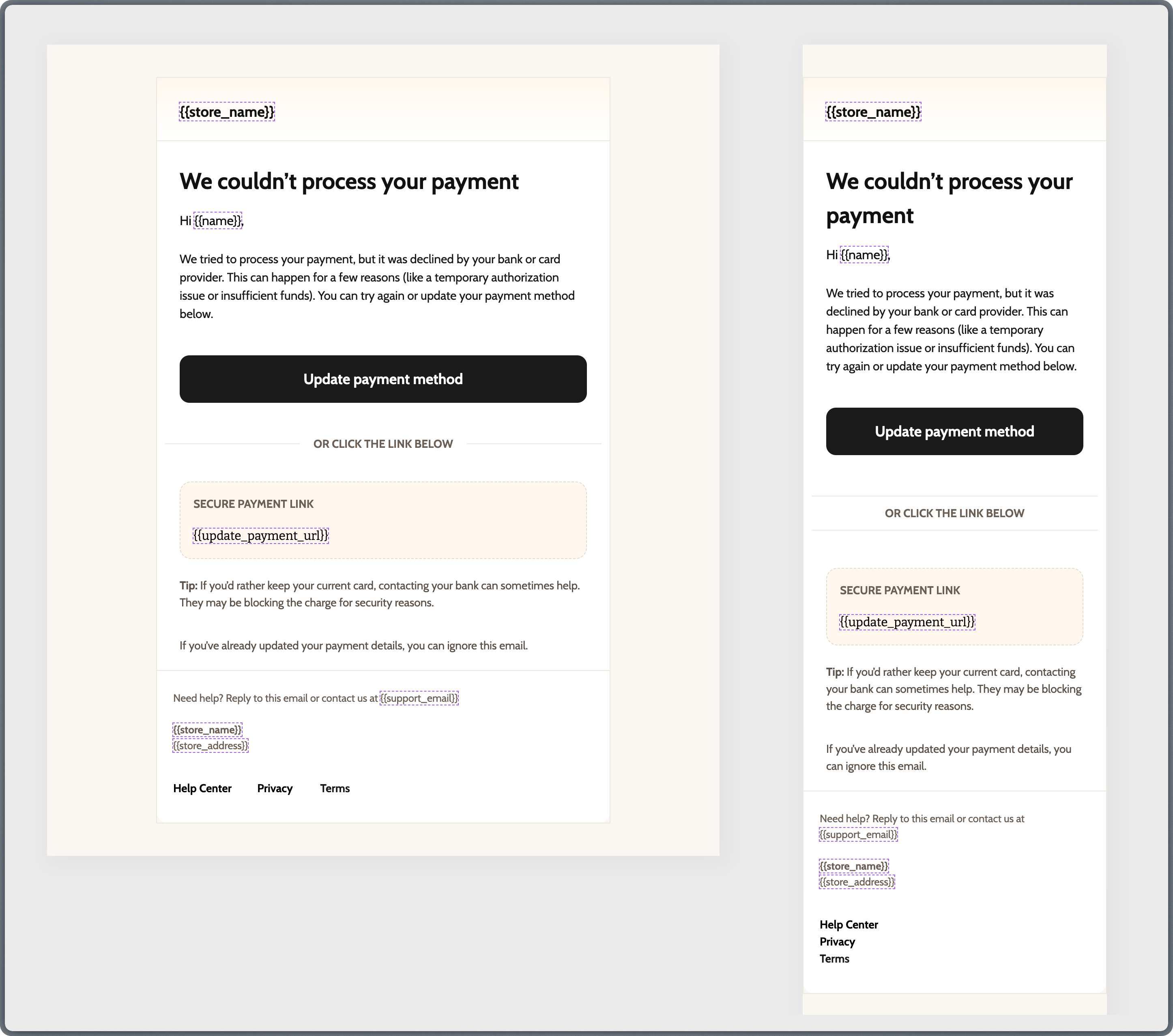
Show hidden
The Show hidden button reveals content that is set to be hidden on the currently active view (desktop or mobile). This is essential when you want to create a different layout for mobile that doesn’t include all the same content as the desktop version. To achieve this, first duplicate the section or block that should appear differently on desktop and mobile. Then, while switching between Mobile and Desktop views, create the desired layout for each version. Then, enable “Hide on desktop” for the version that should be visible only on mobile and “Hide on mobile” for the version that should be visible only on desktop.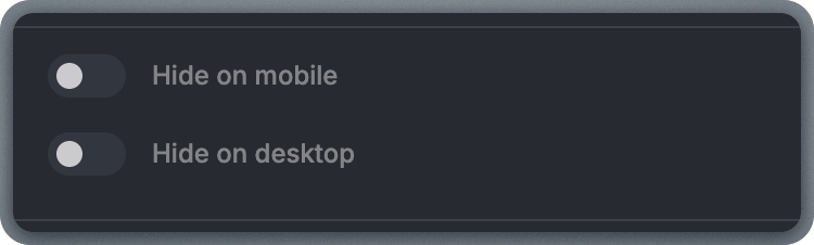
Autosave history
Autosave history lets you view and restore earlier versions of your template that were saved automatically in the background. Autosaves happen at regular intervals and help protect your work if something goes wrong. For more details, see the Autosave with version history article.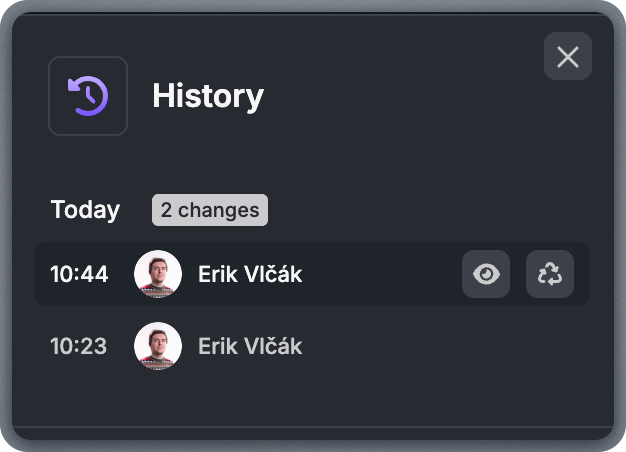
Save
The Save button stores the current state of your template. Saving makes sure your latest changes are preserved and available the next time you open the template. Even though autosaves run in the background, it’s still a good habit to save manually after finishing meaningful changes, such as finalizing content, adjusting layouts, or preparing a template for review.Fullscreen
The Fullscreen option expands the editor to fill your entire screen, removing surrounding distractions. Fullscreen mode is useful when working on long templates, reviewing the overall flow, or focusing on fine visual details like spacing and alignment. Having more space makes it easier to spot inconsistencies or areas that need adjustment.Ideal Workflow
A reliable workflow that works for most templates follows these steps: 1. Place structures for your layout. Don’t worry about content yet. Focus on creating the main skeleton: header area, hero section, main content sections, product areas, and footer. 2. Define your global styles. Open the Settings tab and configure background color, block color, button color, link color, text styles, spacing, and more. For a full overview of available settings, see the Settings panel guide. 3. Add content blocks. Drag text, images, buttons, dividers, spacers, social icons, videos, GIFs, or product blocks into the structures you prepared. 4. Review on desktop and mobile. Switch between views regularly as you build, and do a thorough review once all content is in place. Check stacking order, spacing, button tap targets, and text readability on both views. 5. Preview and test. Use the Preview and Testing tools to see how the email renders. Send a test email to yourself and check it in at least one desktop and one mobile email client before finalizing.This workflow reduces rework. When global styles are defined first, individual blocks require fewer adjustments and the final template looks more consistent.
Common Issues and Troubleshooting
Even experienced users run into issues from time to time. This section covers the most common problems and how to solve them.Content won't drop into the template
Content won't drop into the template
You’re likely trying to drag a content block directly onto the canvas without a structure in place. Content blocks must be placed inside a column within a structure. First drag a structure onto the canvas, then drag the content block into one of its columns.
Columns look cramped or broken on mobile
Columns look cramped or broken on mobile
Multi-column structures stack vertically on mobile by default, but if you’ve disabled “Stack columns on mobile,” columns will try to remain side-by-side on narrow screens. Re-enable stacking unless the content is very short. Also check that column padding isn’t set to zero—some spacing helps readability on smaller screens.
Layout looks different in email clients than in the editor
Layout looks different in email clients than in the editor
Email client rendering varies significantly. The editor preview is a good approximation, but some clients (particularly Outlook on Windows) handle spacing, fonts, and backgrounds differently. Always send a test email and check it in multiple clients. Stick to standard content blocks and avoid custom HTML when possible, as built-in blocks are tested for cross-client compatibility.
Images appear broken or don't display
Images appear broken or don't display
Check that images were uploaded through the File Manager (not just linked from a temporary source). Externally hosted images may be blocked by email clients or firewalls. Also verify that the image URL is HTTPS—some email clients block HTTP images. If images still don’t appear, the file may have been deleted from the File Manager or the Storage Domain may not be configured correctly.
Image uploads fail or timeout
Image uploads fail or timeout
Large image files (over 2 MB) may fail to upload. Resize and compress images before uploading. Use JPEG for photos and PNG for graphics with transparency. Also check your internet connection—slow or unstable connections can cause upload timeouts.
Template looks fine on desktop but broken on mobile
Template looks fine on desktop but broken on mobile
This usually happens when content is too wide for mobile screens. Check image widths (keep them under 600px), ensure text blocks aren’t using fixed widths, and verify that column stacking is enabled. Also check for structures with “Do not stack on mobile” enabled—these are the most common source of mobile layout issues.
Editing one language version changes the layout in others
Editing one language version changes the layout in others
In multilingual templates, all language versions share the same structure. Adding, removing, or rearranging structures in one language affects all of them. Only text content is independent per language. If you need a different layout for a specific language, consider using separate templates instead of the multilingual feature.
Gmail clips the email with a 'View entire message' link
Gmail clips the email with a 'View entire message' link
Gmail clips emails larger than approximately 102 KB. This can happen when templates include many large images, excessive hidden content, or bloated custom HTML. To avoid clipping, optimize image sizes, minimize hidden content, keep the template concise, and avoid unnecessary custom HTML. You can check your template’s approximate size by exporting the HTML and checking the file size.
Further Reading
Topol Editor Technical Guide
Developer-oriented introduction to the editor’s architecture and workflows
Saved Blocks
Create reusable sections and synced content across templates
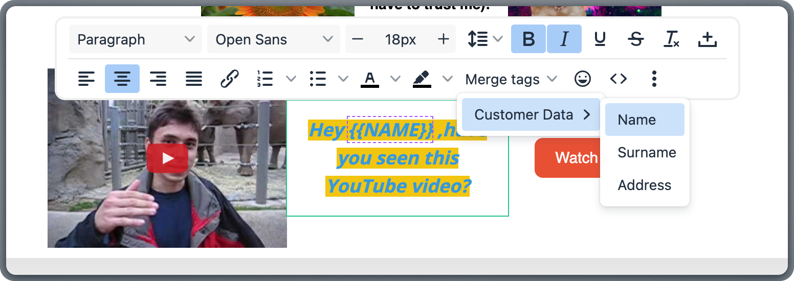
Template Language
Merge tags, conditionals, loops, and default values
Topol Support Center
Detailed step-by-step guides for every editor feature